User analytics
AdminsHow often do users sign in to the platform?
StudentsStaffFamiliesVisitorsDaily / weekly
Case study · Toddle · Insights
Toddle runs teaching and learning for K-12 schools: planning, assessment, attendance, family communication. I designed Insights, the analytics layer that tells school leaders and coordinators what is happening across all of it.
Pick a question. Each one is a real chart title from the product.
adoption within three months
satisfaction
use AI insights every week
Where it started
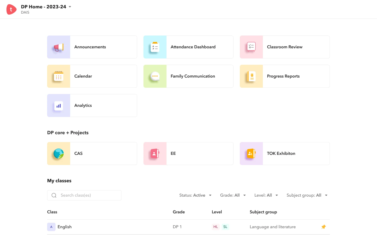
Toddle's home is a grid of modules: announcements, attendance, classroom review, calendar, family communication, progress reports. Every one of them produces data. Who read the announcement. Who turned in the essay. Who has missed nine days of school.
The data existed. What a head of school or a DP coordinator lacked was one place to read it, at the level they think at: the whole school, a year group, a subject, a class, one student.
The first explorations organised that place the way the database does: report types in a sidebar, then a list of students to click into. It was complete, and it made the leader do the analysis.
Scope
I split Insights by the question being asked, not by the data source. Each family has its own landing page and goes deeper from there.
How often do users sign in to the platform?
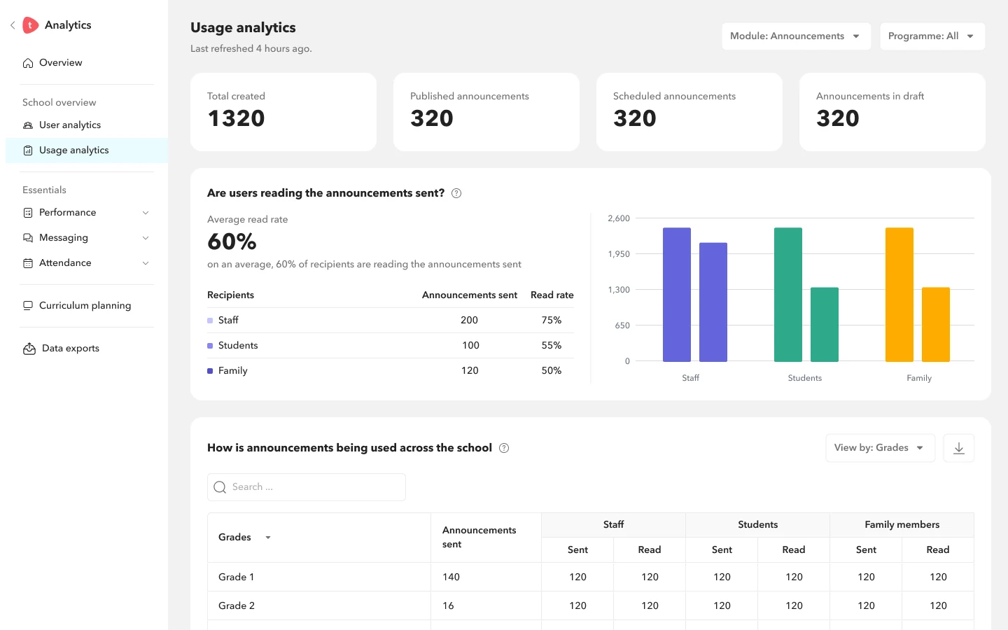
Are people using the modules we pay for?
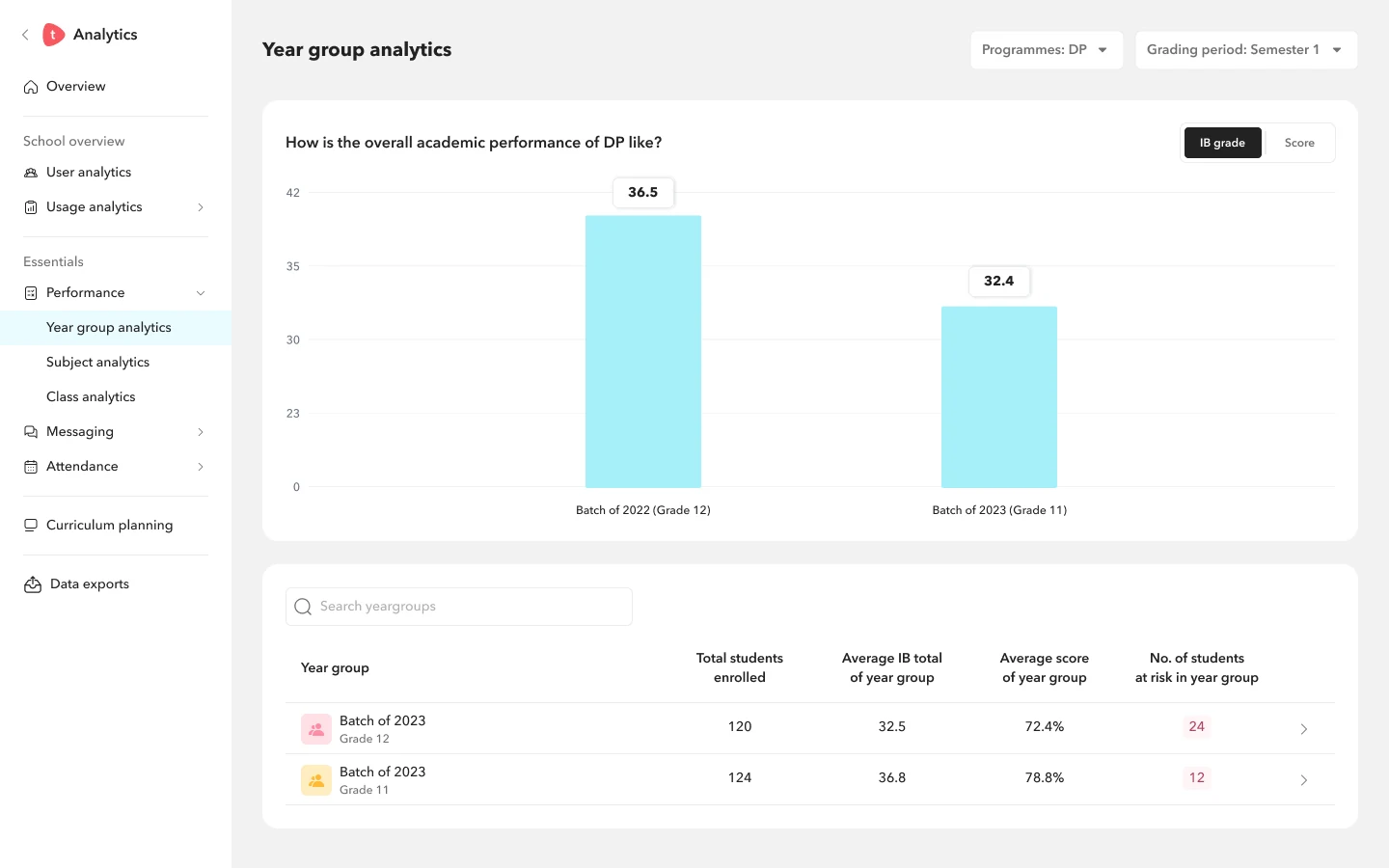
How is the overall academic performance of DP like?
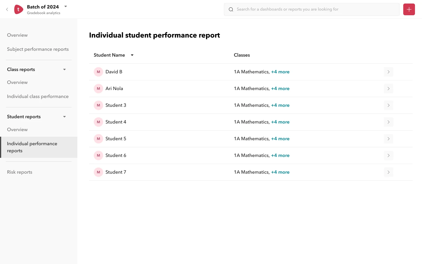
How has the student's overall performance been like?
The principle
A label like "Read rate by recipient" asks the reader to work out why it matters. A question tells them before they look at a single bar. These are titles from the shipped designs, kept in the school's own words.
The decision
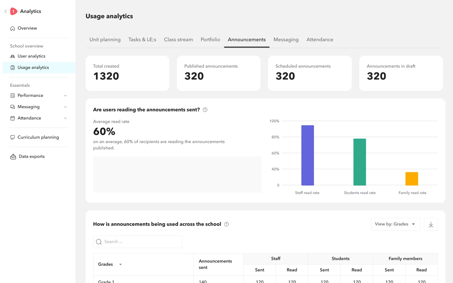
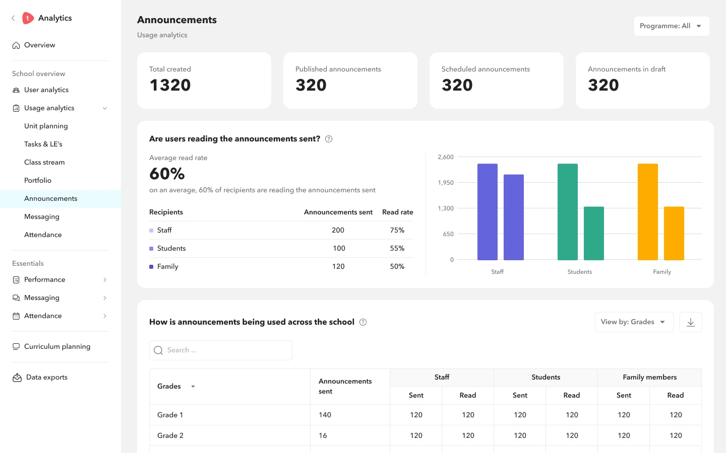
Usage analytics covers seven modules, and Toddle keeps adding more. I explored the same Announcements page three ways and judged each one by how it would hold up as the module count grew.
Drill-down
Each level answers its own question and points at the next one. A coordinator can start at "how is DP doing?" and end on the one student who needs a conversation this week.
How is the overall academic performance of DP like?
Two batches side by side, by IB grade or by score. The table underneath keeps the number that matters most on every row: students at risk.
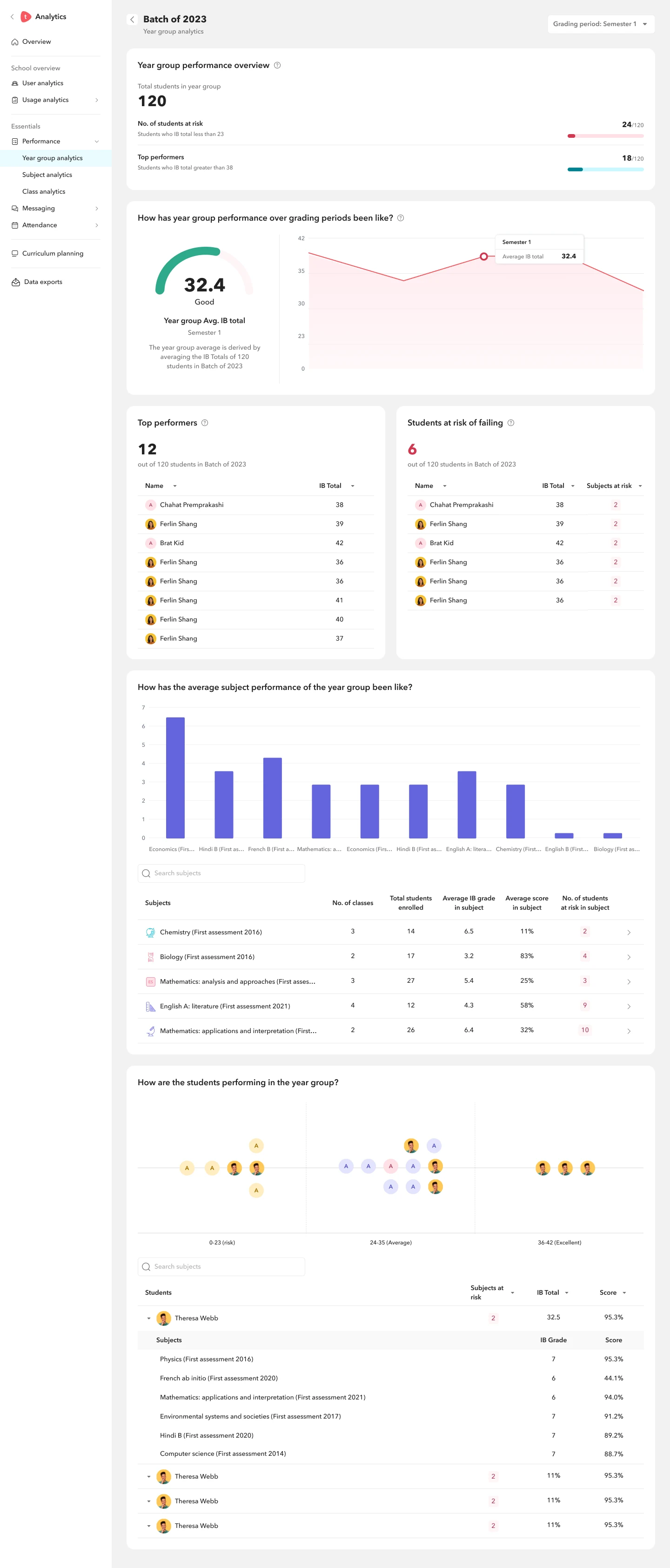
How has year group performance over grading periods been like?
The batch page opens with the count, then the trend, then the names. Top performers and students at risk of failing sit next to each other, so nobody has to export a spreadsheet to find either list.
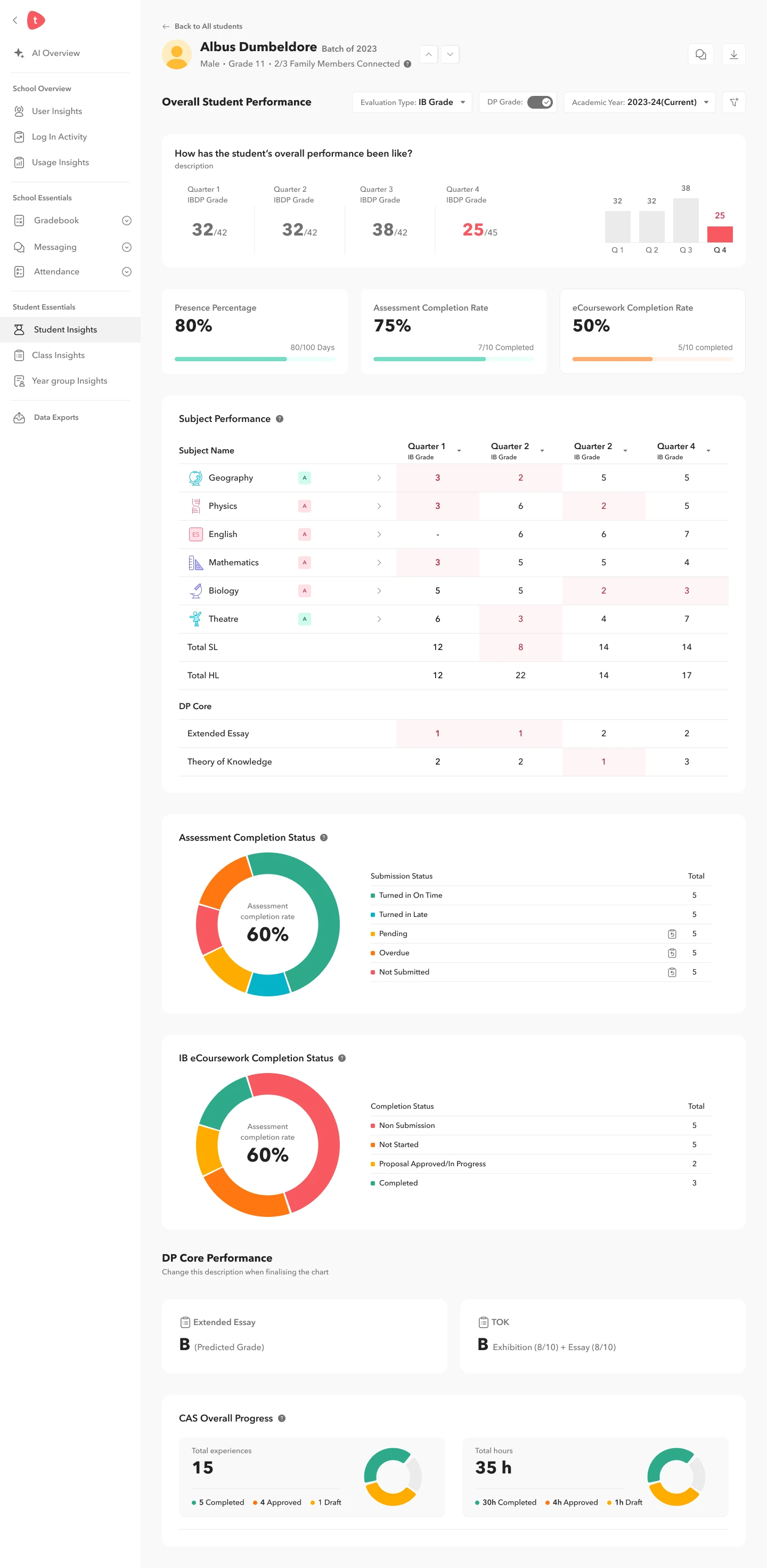
How has the student's overall performance been like?
Quarter grades, presence, assessment and eCoursework completion, then every subject with weak quarters marked in red. The fourth quarter drop to 25 out of 45 is the first thing you see.
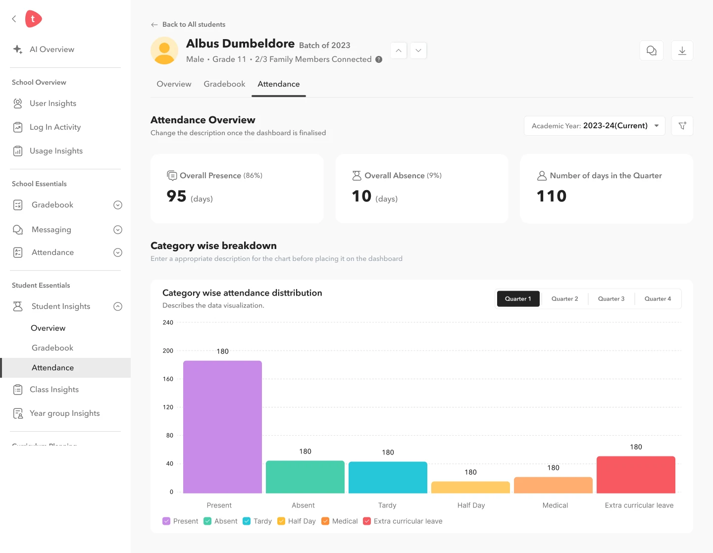
The same student, one tab over. Attendance, gradebook and class stream share the student's header, so switching context never loses the person you are looking at.
Outcome
Measured from launch across schools on Toddle.
From the leaders and coordinators using Insights.
Seven in ten users come back to AI insights every week.